Zone
00:00 AM
LET'S TALK
LET'S TALK
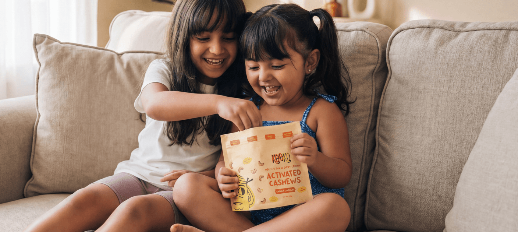
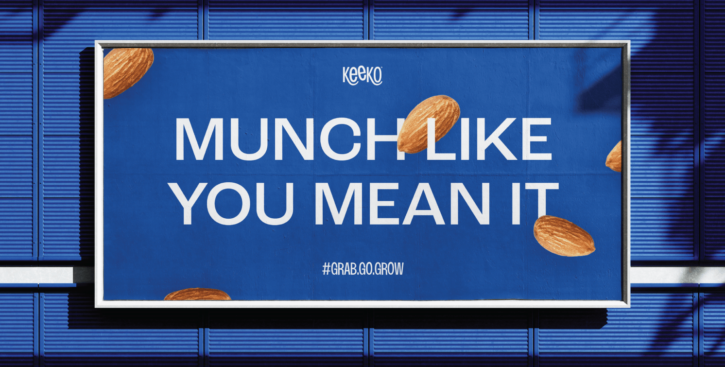

In a market crowded with “better-for-you” brands all saying the same things - clean, natural, guilt-free - the challenge was to build a healthy snacking brand people could actually connect with. Most brands in the category felt functional, clinical, and forgettable. Keeko needed to feel different. Not like a nutrition brand trying to be fun, but a fun brand that just happened to be good for you. The goal was to create a brand people would genuinely want in their everyday lives - something impossible to ignore on a crowded shelf or a kitchen counter.
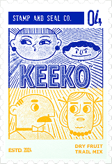
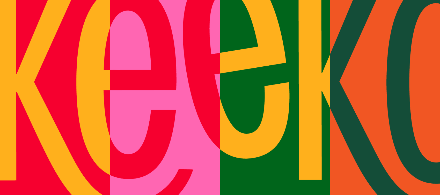
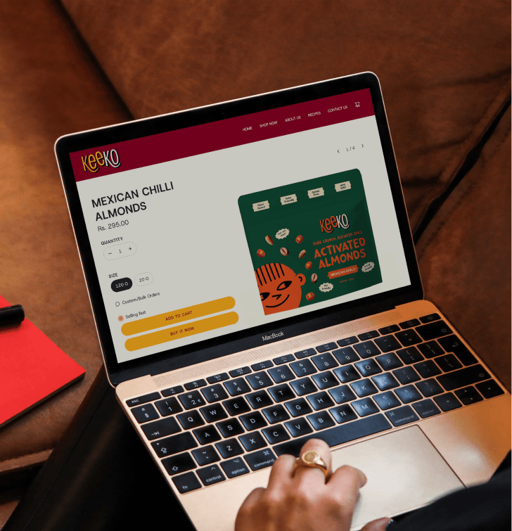
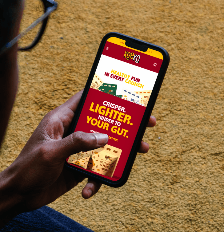
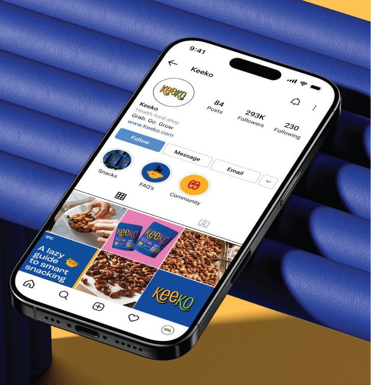
Keeko was designed as a vibrant, playful, and modern healthy snacking brand that instantly stands out on grocery shelves while appealing to both children and young parents. Through bold colours, expressive characters, playful typography, and energetic packaging visuals, the brand creates a joyful snacking experience that feels fun and engaging for kids while still maintaining the trust, quality, and clean positioning.
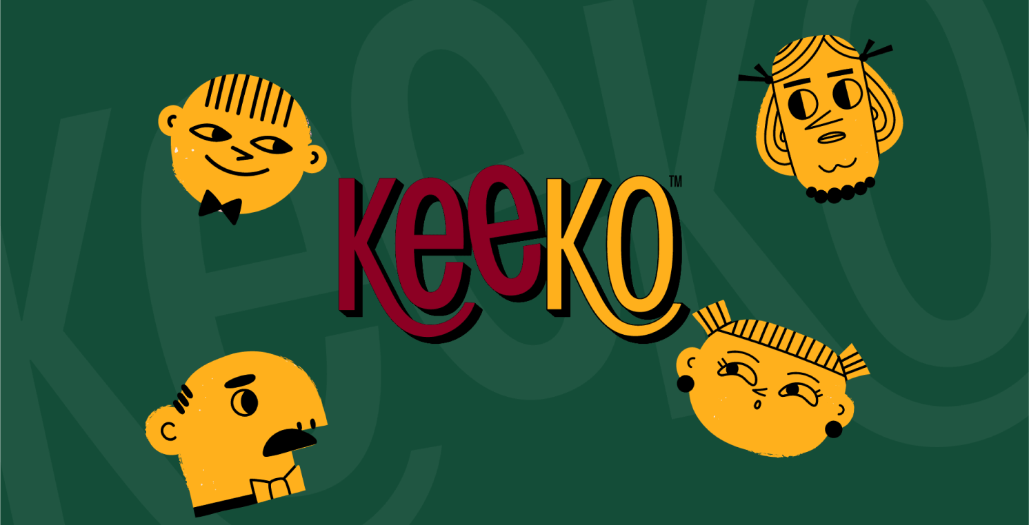
The brand identity was brought to life through the creation of Kee & Ko - a playful cast of unique characters designed to make the packaging feel fun, expressive, and emotionally relatable for children. Each character was intentionally designed with its own personality, appearance, and visual style to create a more engaging world around the product while helping build a memorable and recognizable brand identity through storytelling-led design.