Zone
00:00 AM
LET'S TALK
LET'S TALK
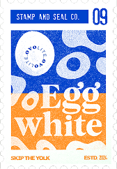

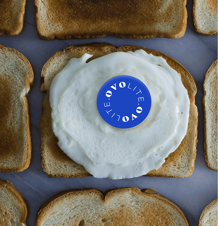


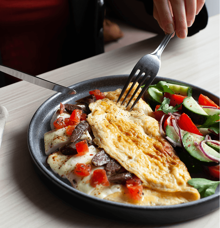

The branding was built around the idea of making health-conscious living feel playful, bold, and culturally relevant rather than clinical or overly fitness-focused. With the tagline “Skip the Yolk,” the identity positioned the brand around simplicity, convenience, and smarter nutrition through vibrant visuals, quirky typography, and confident messaging that made a first-of-its-kind product in India instantly memorable and easy to connect with.
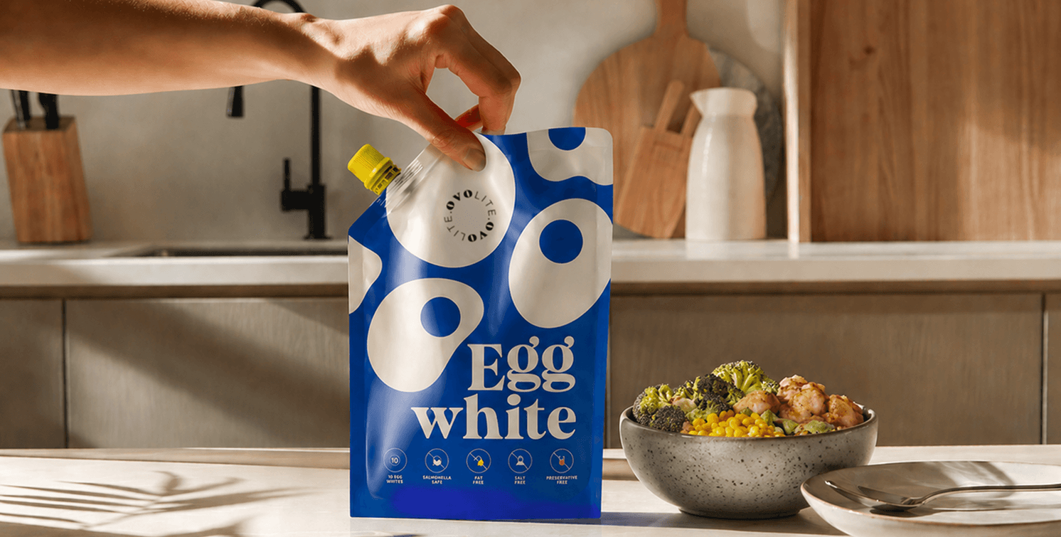
The packaging system was designed to visually reinforce the product experience in a subtle but meaningful way. The bright yellow cap symbolised the yolk itself-creating a small, intuitive interaction where consumers physically remove the “yolk” before consuming the egg whites inside. Combined with bold colours, oversized graphics, and clear communication, the packaging transformed a functional nutrition product into an engaging and instantly recognizable shelf experience.